
When you are sick and go to the doctor’s office, the first thing the nurse does is check your temperature.
Scientists do the same with our planet. They have been monitoring the Earth’s surface temperature for decades to observe trends.
How Is Temperature Measured?
Surface temperatures have been measured by thermometers and instrument-based weather stations for hundreds of years. Since the 1880s, it has been watched closely.
Ships and buoys with sensors measure air temperature above the Earth’s oceans. Weather balloons and satellites take temperatures in hard-to-reach areas of our world, like deserts and the frozen Arctic.
What Does The Data Tell Us?
, and a negative means cooler than average; globalchange.gov/NCA2018")
The global average temperature has increased by 1.8ºF (or 1ºC) compared to the 1850s. Also, since 1960, every decade has been hotter than the previous decade. In fact, twenty of the hottest years have happened in the last 22 years.
This temperature rise has not been uniform, though. Some parts of the world, such as the Arctic, are warming much faster. Other places, like the Southeastern U.S., have experienced no change or even a slight cooling.
Temperatures also change in the short term because of ocean circulation. For example, 2007-2008 was cooler than other years, which was because of an unusually strong La Niña.
Temperature trends are usually influenced by atmospheric, ocean, and human activities. There will be ups and downs, but the average global temperature has been steadily increasing.
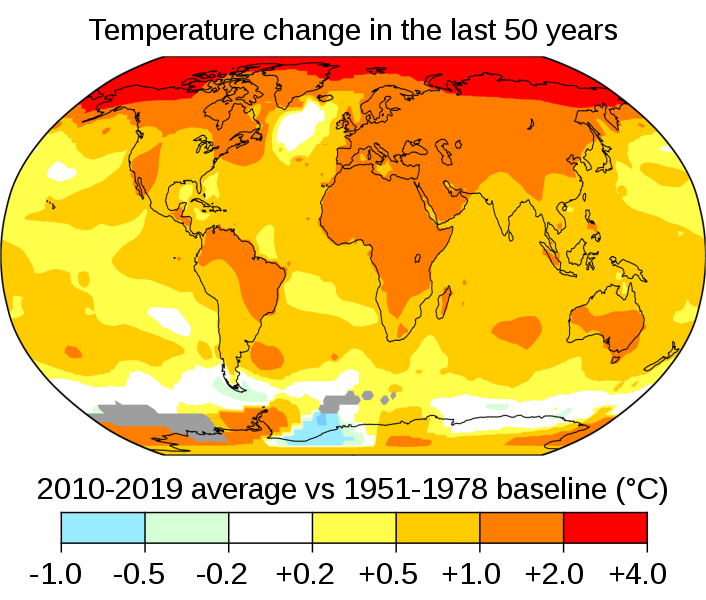
The figure below shows changes in average temperature from 2010-2019 compared to the period from 1951-1978. The more red an area is, the warmer its average temperature.
What do you notice?
Summary
- Data tells us that our Earth's average temperature has increased by 1.8ºF (or 1ºC) compared to the 1850s.
- In the short term global temperatures may vary, but in the long term the globe is heating up.
- Some places like the Arctic are heating up much faster than others
When you are sick and go to the doctor’s office, the nurse often begins by checking your temperature.
In much the same way, scientists have been "taking Earth’s temperature" for decades to track changes and identify trends in our planet's climate.
How Is Temperature Measured?
Surface temperatures have been measured by thermometers and instrument-based weather stations for hundreds of years. Since the 1880s, these measurements have been taken regularly around the world.
Over the oceans, ships and buoys equipped with sensors capture air temperature just above the water's surface. Weather balloons and satellites help scientists measure temperatures in remote and hard-to-reach areas, such as the middle of deserts or over the icy Arctic.
What Does The Data Tell Us?
The global average temperature is now 1.8ºF (or 1ºC) higher than it was in the 1850s. Since 1960, every decade has been warmer than the one before. In fact, twenty of the hottest years ever recorded have occurred within the past 22 years.
Figure 2.1.2 shows average temperatures by decade, with the zero line representing the 1901-1960 average.
However, this warming has not been uniform across the globe.
- Rapid warming: The Arctic is heating up nearly four times faster than the rest of the planet.
- Little change or cooling: Parts of the central North Atlantic Ocean and the southeastern U.S have stayed about the same or cooled slightly over the last 100 years.
- Short-term fluctuations: Some years are cooler than others because of ocean circulation patterns. For example, 2007-2008 was cooler than nearby years because of an unusually strong La Niña.
Even though there are short-term ups and downs, the long-term trend is clear. Earth's temperature is steadily rising because of a mix of atmospheric changes, ocean patterns, and human activities.
Figure 2.1.3 below compares temperatures from 2010-2019 to those from 1951-1978. The redder the area, the more it has warmed. What patterns do you notice?